Client: Wellin | Creative Director/Art: Maria Samodra | Executive Creative Director/Copy: Kindra Meyer
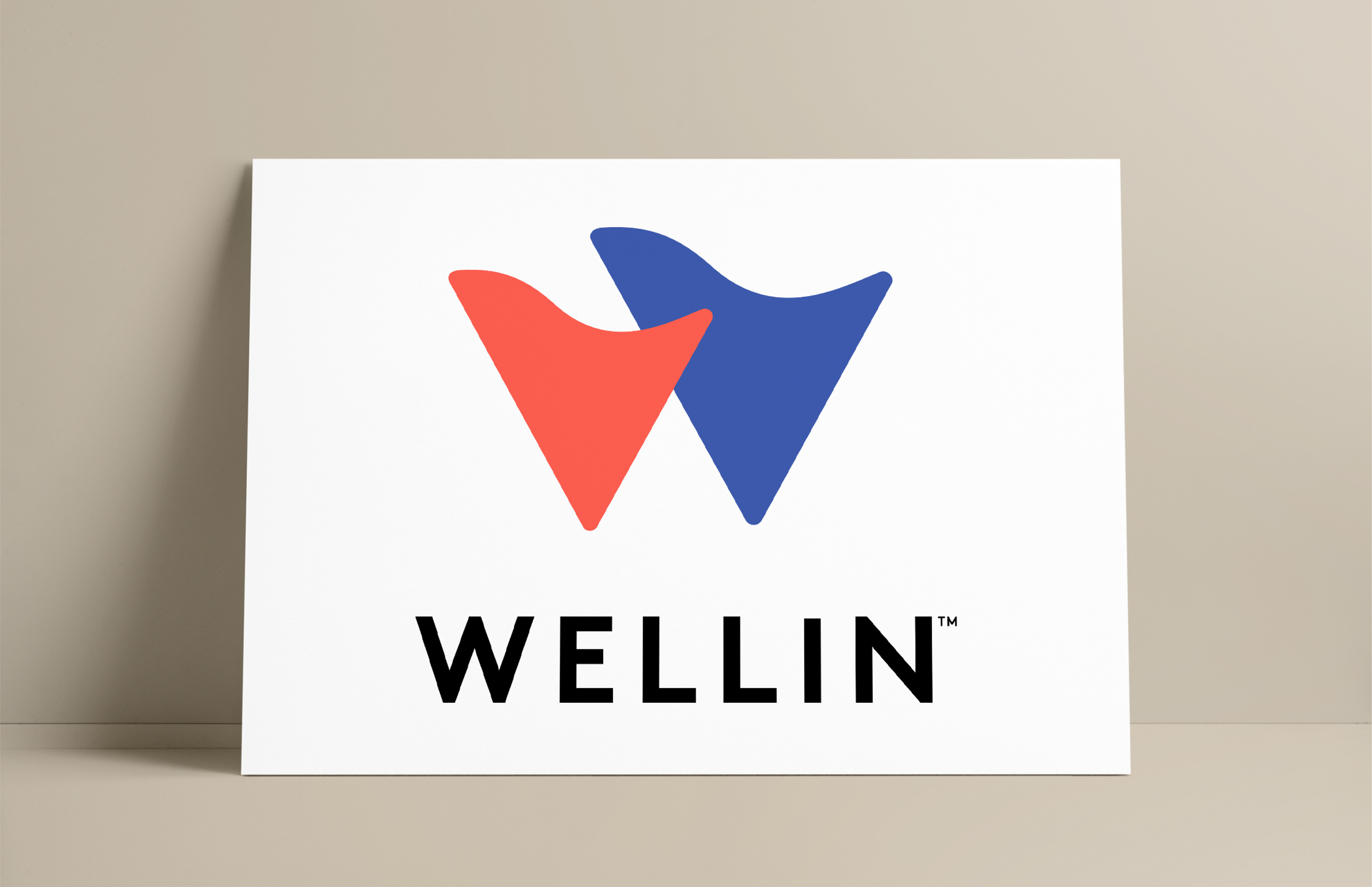
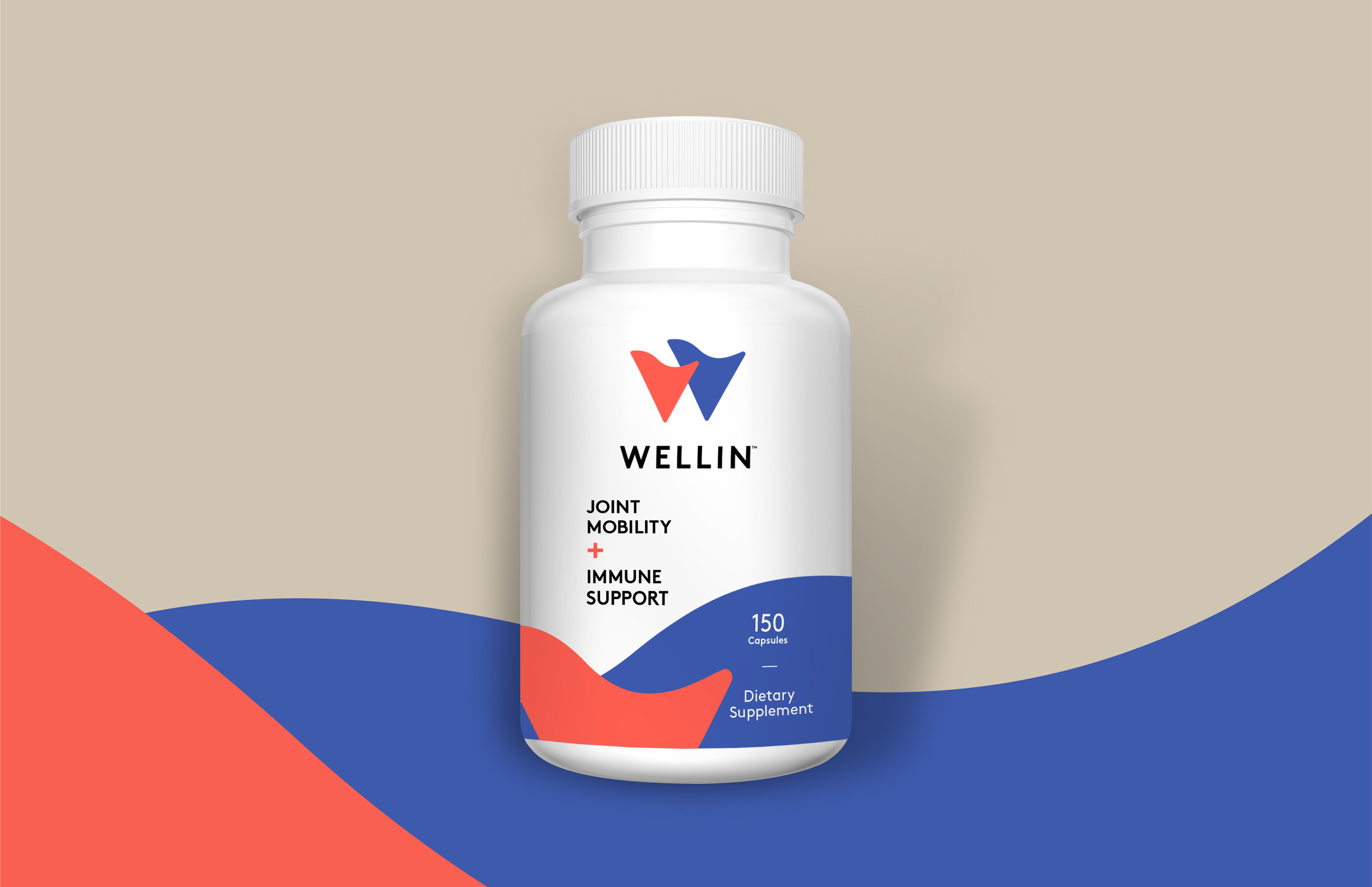
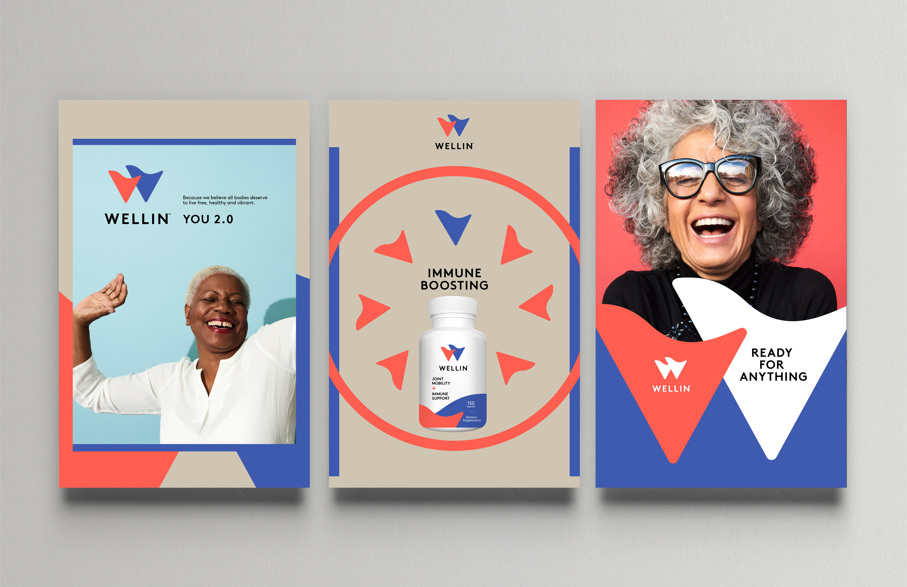
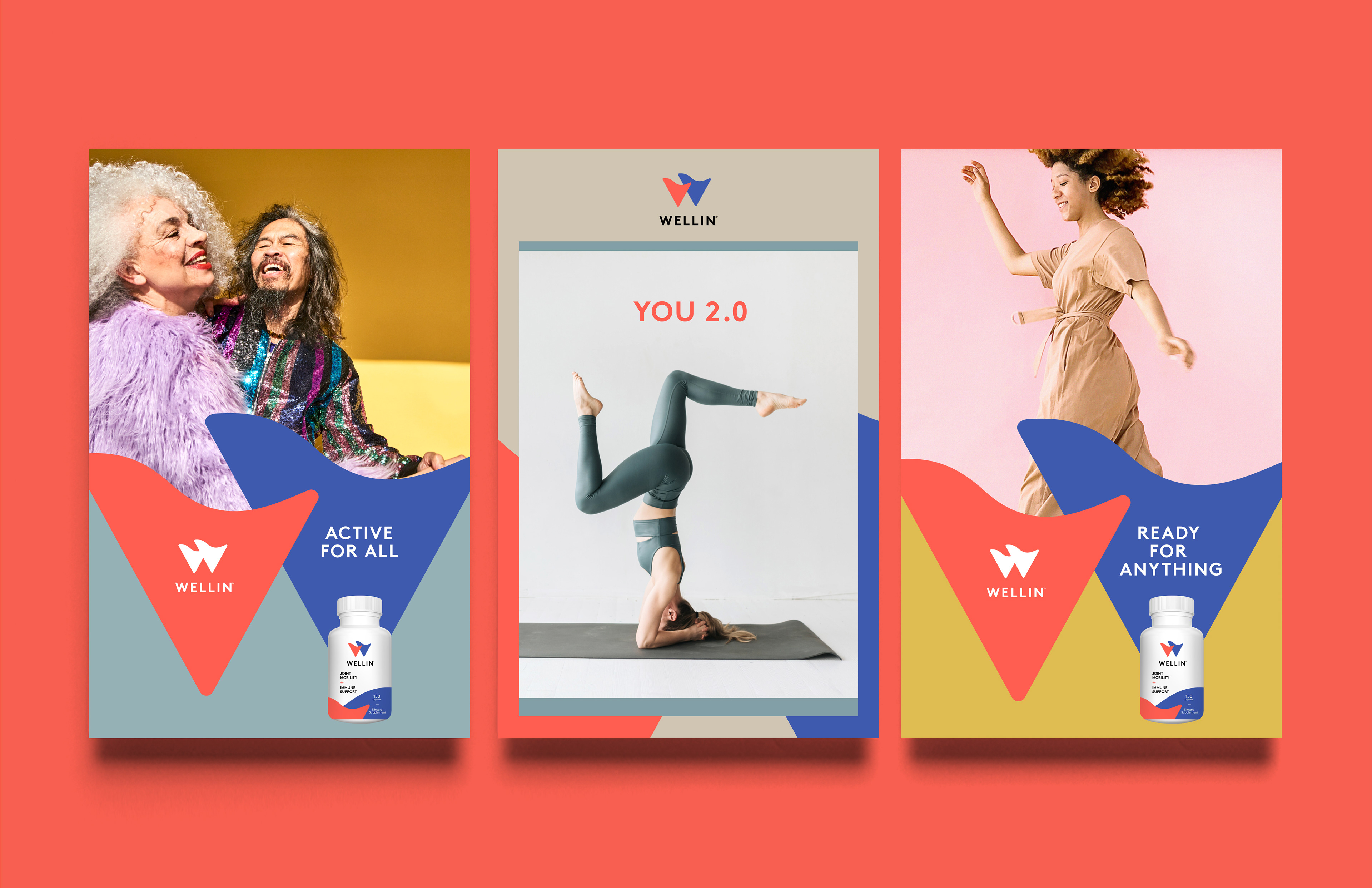
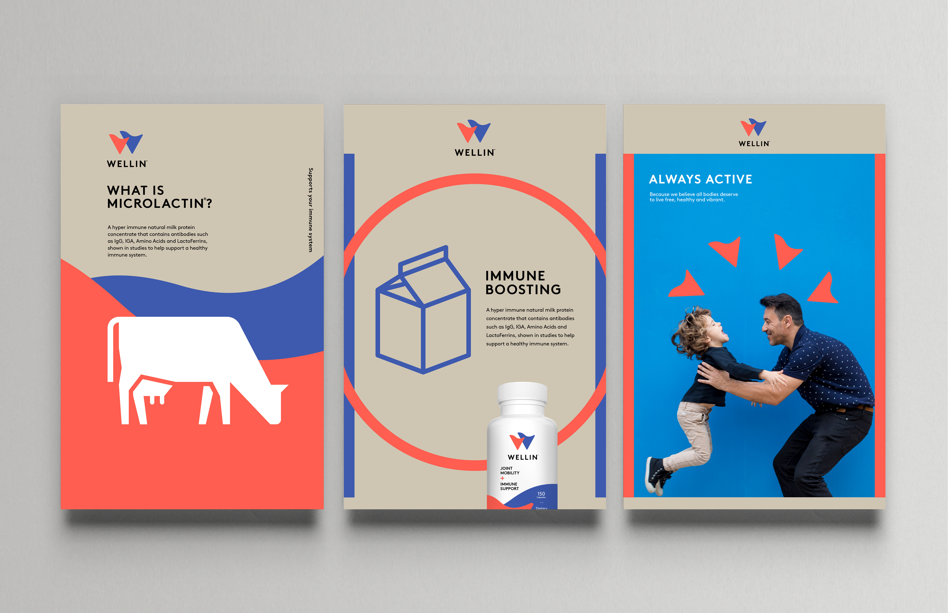
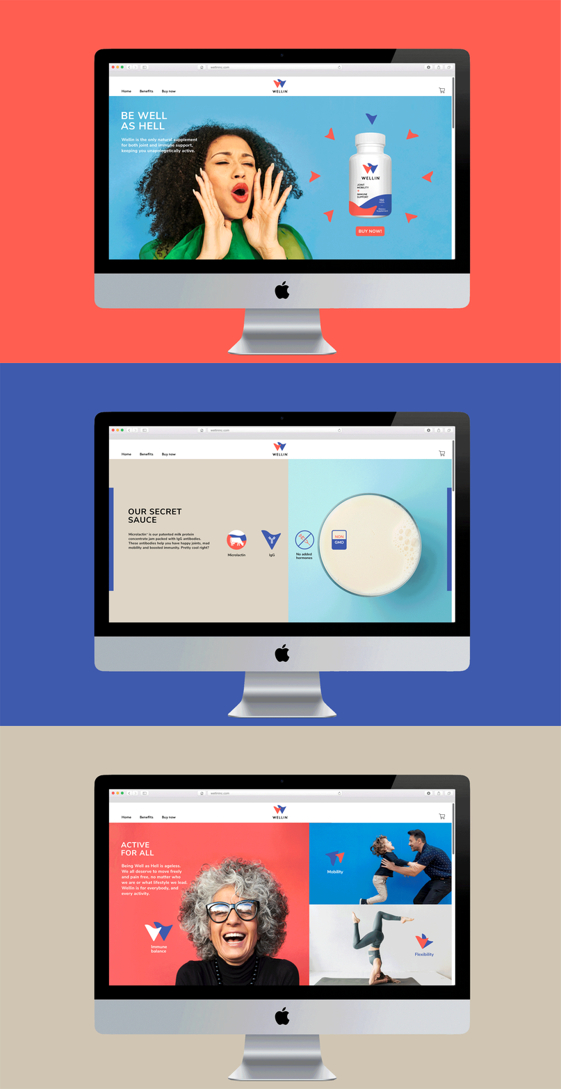
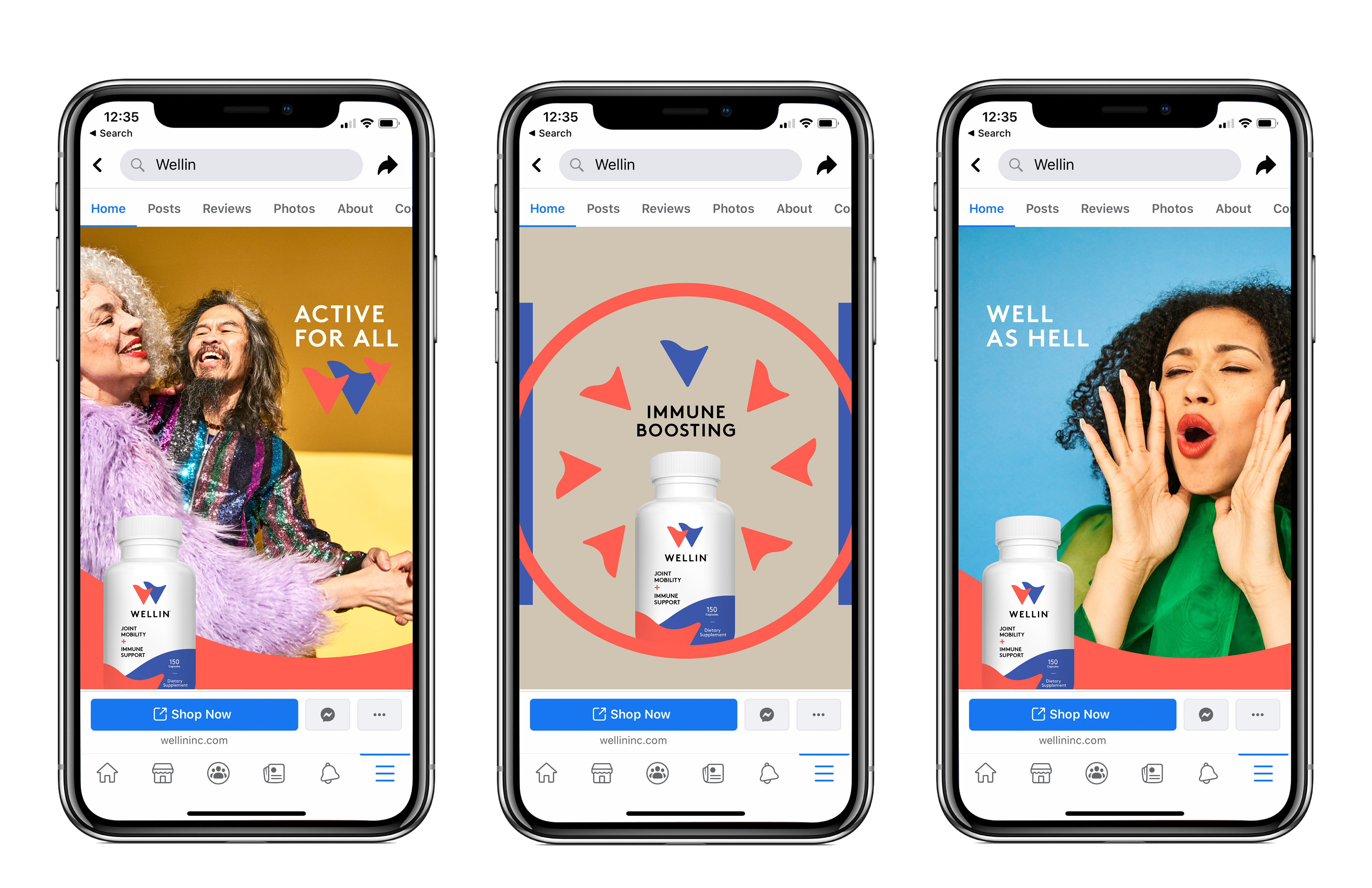
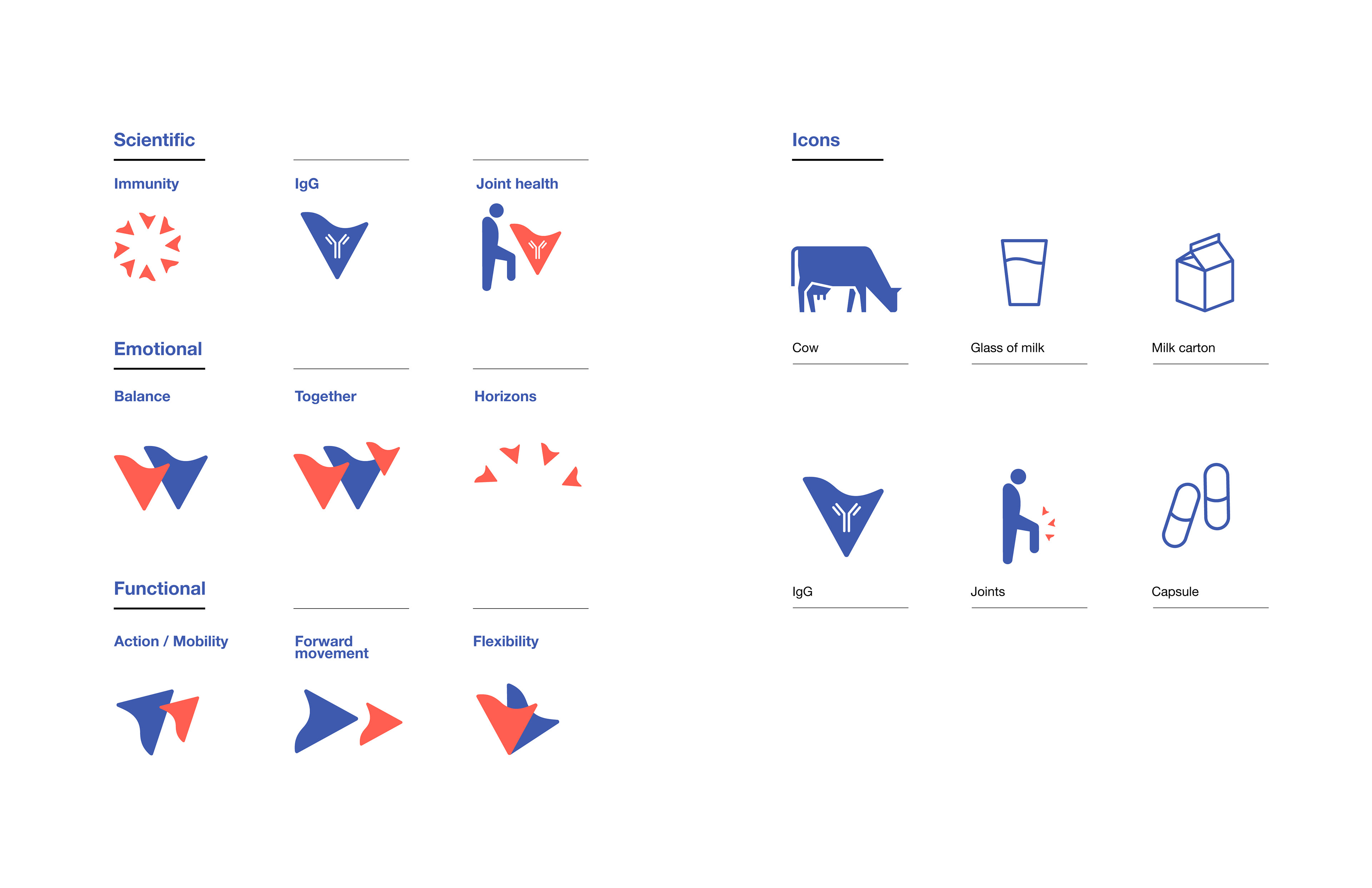
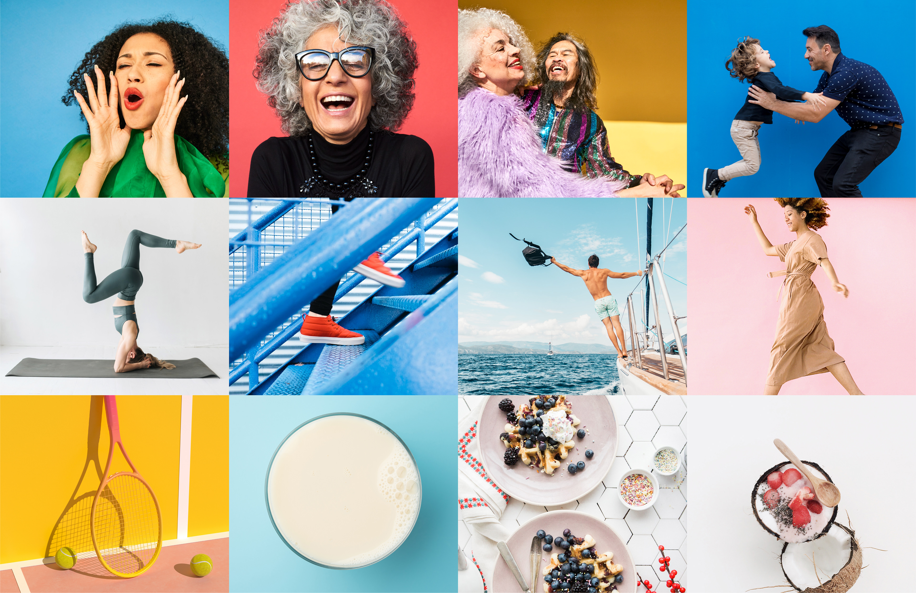
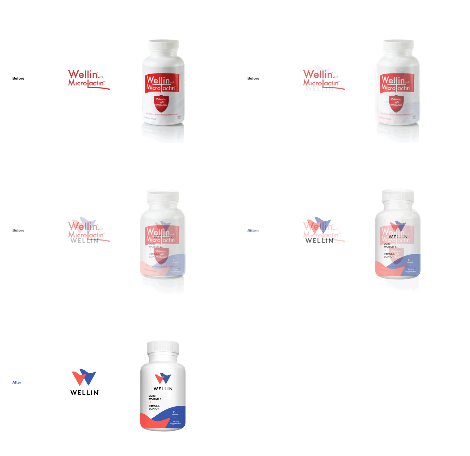
Wellin is a breakthrough new supplement for increased joint mobility and immunity which had dismal sales their first few months on the market. They reached out wanting new copy for their digital/social ads which skewed to a much younger audience than their previous target. After taking a look at their site design, packaging and overall brand, we knew copy alone wasn't going to cut it. Collaborating with Kindra Meyer, we did an overhaul and repositioned their brand for success. Our initial creative exploration led to ad testing on Facebook and Instagram which helped us see what messages and designs best resonated with a younger audience. From there we created “Active For All” a new positioning which tapped into an emotional state rather than an age group, and a much fiercer tone driven by the new tagline WELL AS HELL. We wanted to disrupt the category with a modern look and feel through our logo design, palette and photography style. The logo symbol evokes vitality and fluidity with a "W" hidden within the shape, reminiscent of a shield for protection, mobility and the science behind the ingredients. A whole new set of brand guidelines, all driven by data analytics. The Results, over 200% higher engagement on social and sales increased 220%with a new website coming soon