

Agency: Interbrand New York | Executive Creative Director: William Woduschegg | Creative Director: Maria Samodra | 3D: Frederico Phillips
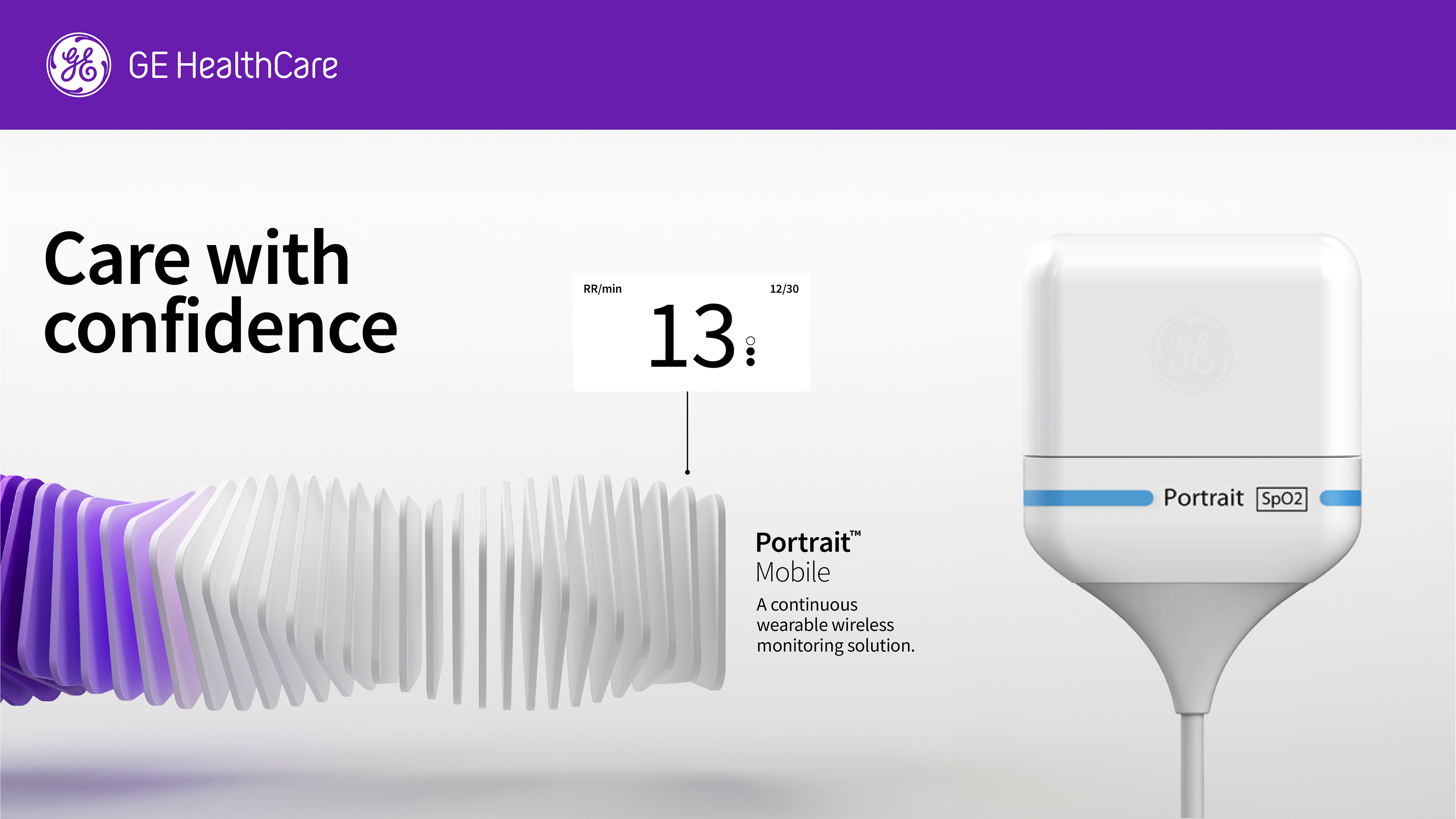
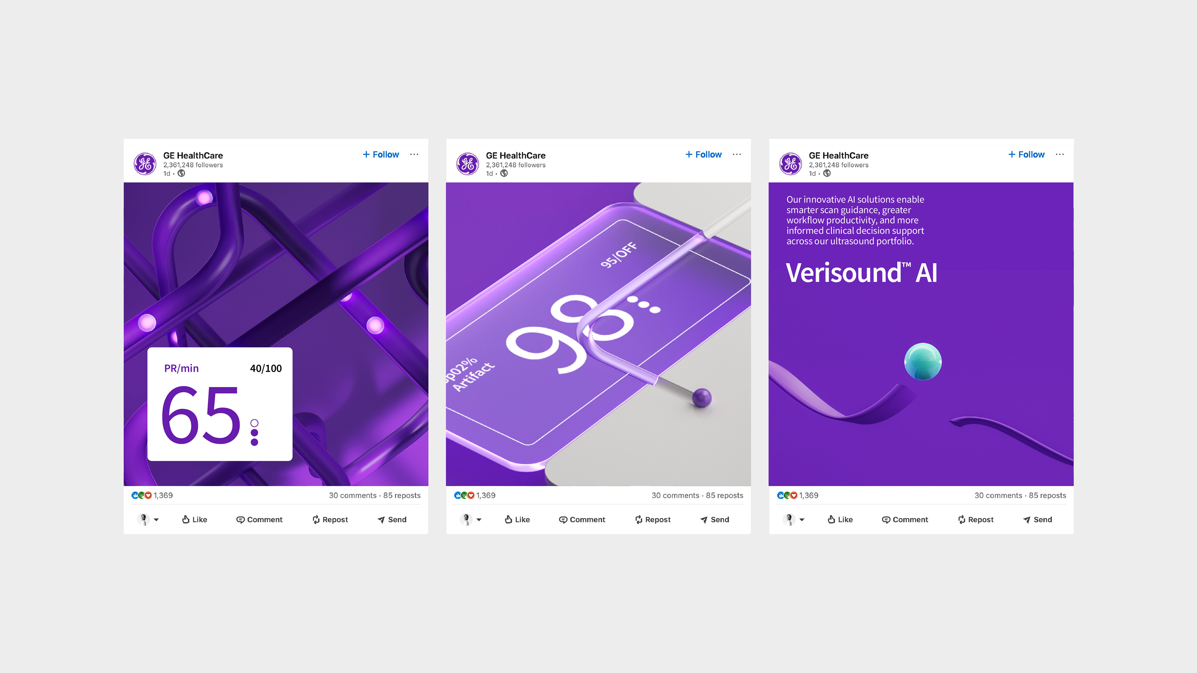
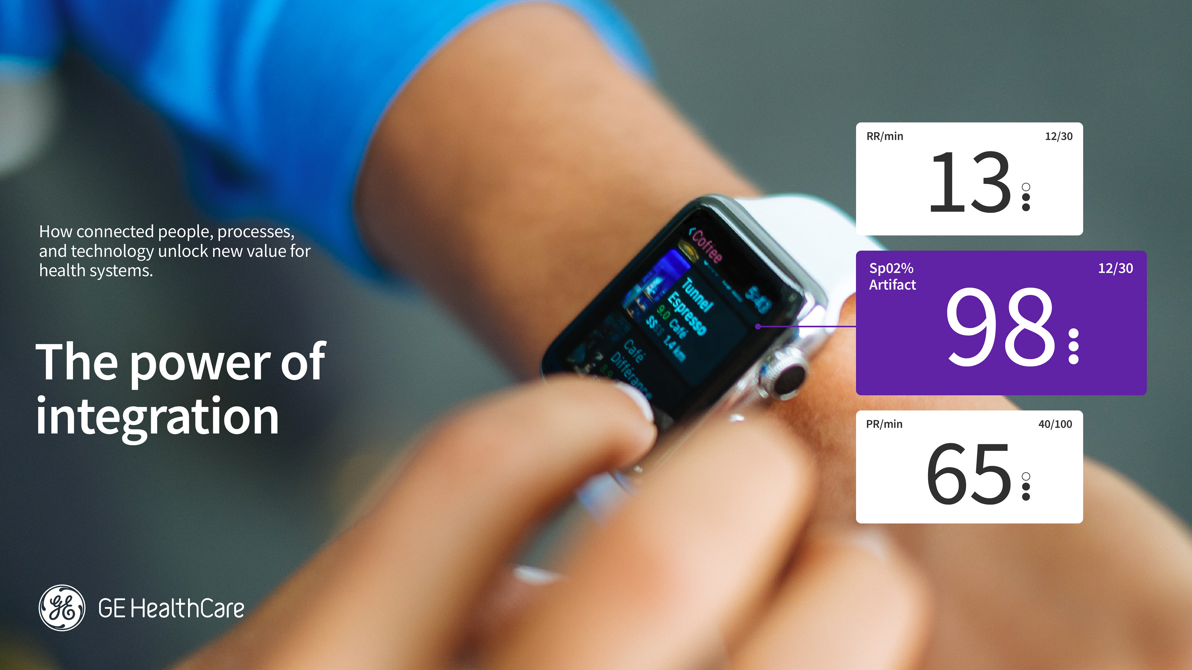
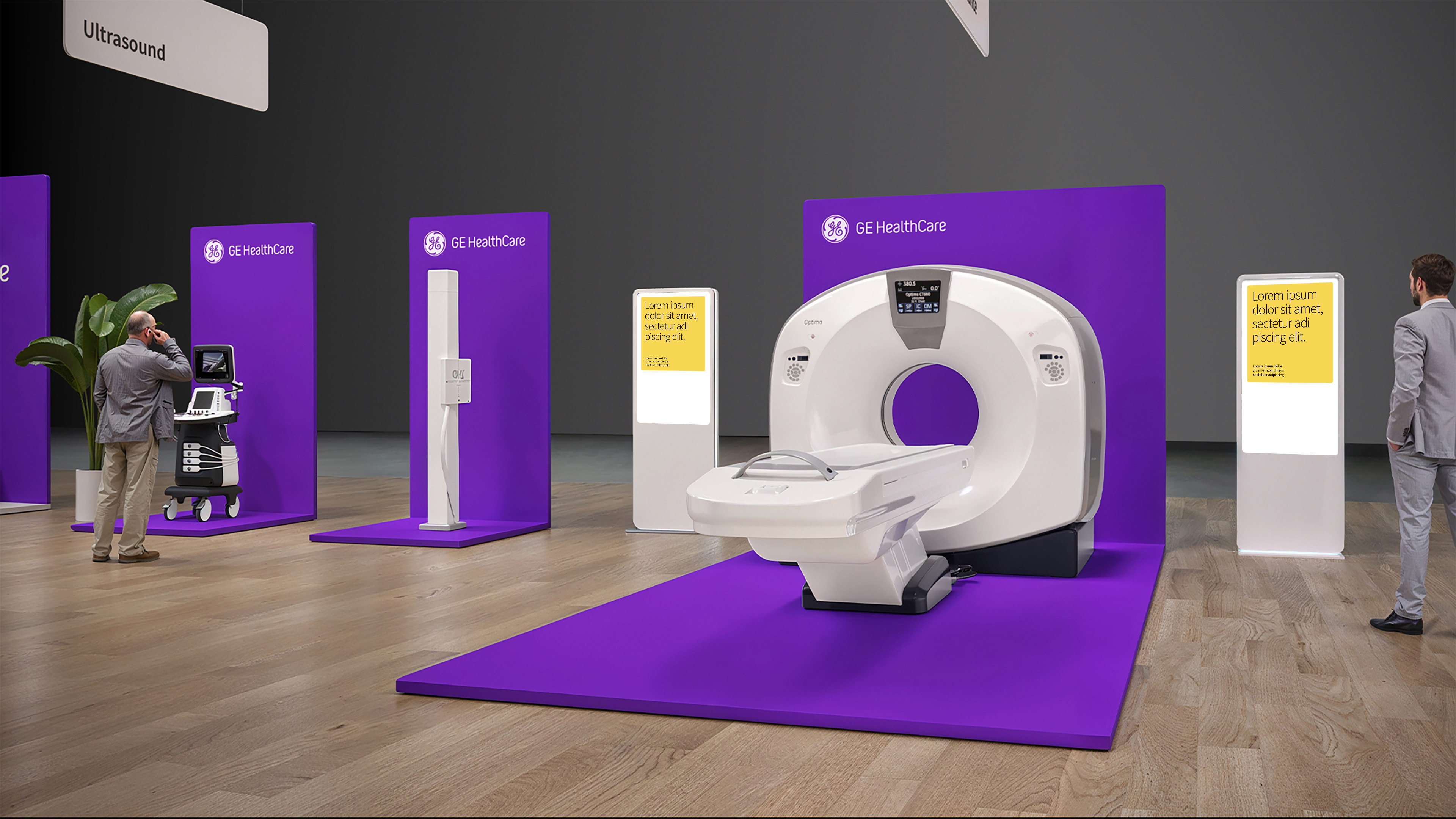
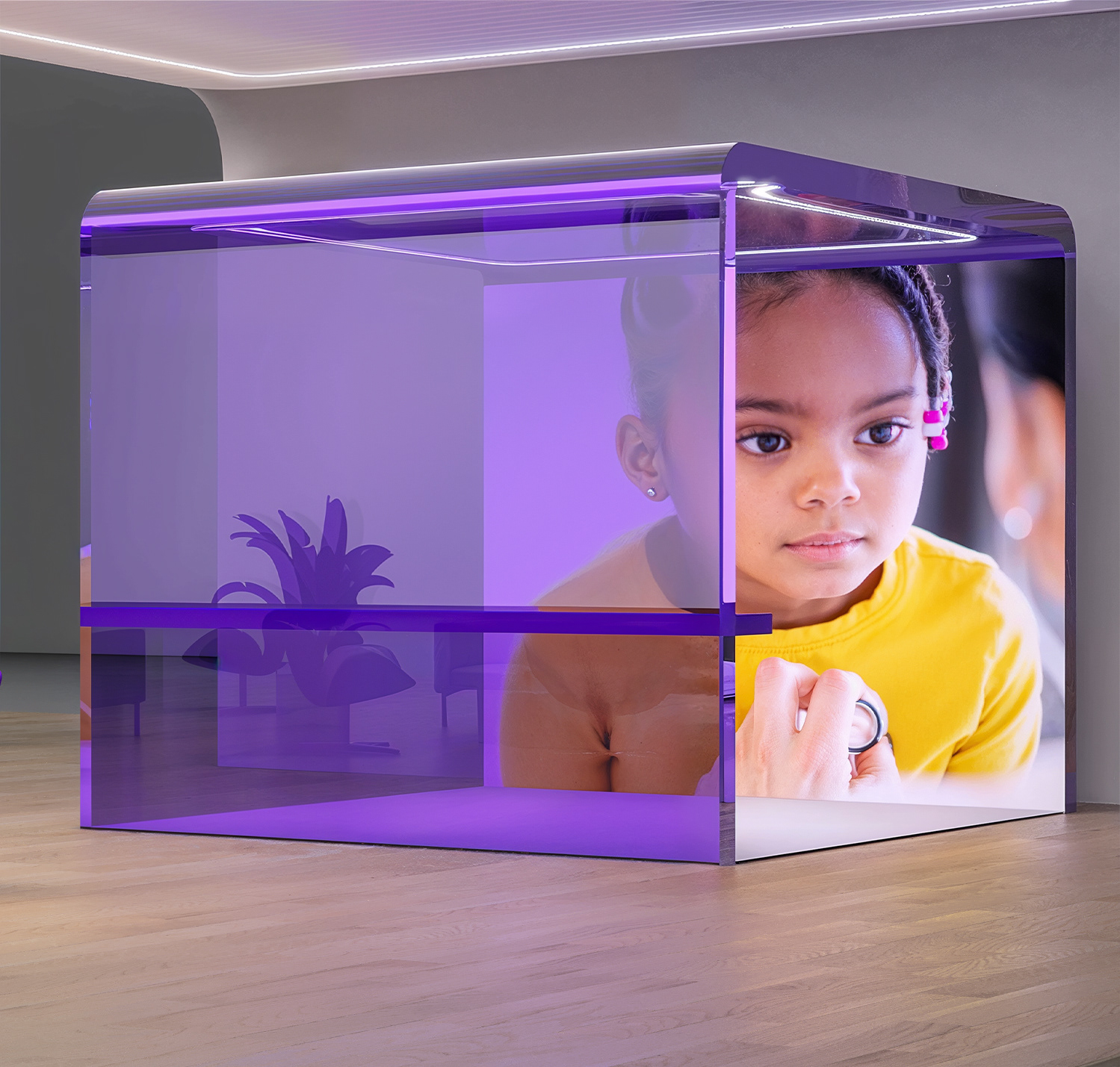
When GE decided to spin off its healthcare operations, it needed a new brand identity that maintained a century of heritage while simultaneously pushed the brand in a new direction. As it became an independent company, GE HealthCare worked with us to reimagine their brand as more human-centric, innovative, and bold. We took the core elements of the GE brand, including its iconic monogram, and created an entirely new wordmark and visual identity, spearheaded by the indelible, differentiating color of Compassion Purple. We also created a complimentary set of colors to evoke the diverse people, organizations, and institutions that GE HealthCare serves. As GE HealthCare becomes more human-centric, we helped create a photography style reflecting real, raw emotion, evoking the successes and challenges the medical community experiences every day. We also helped craft a tone of voice using a plainspoken, low-jargon approach -- refreshingly different from the rest of the industry. We used an open-source typeface, Source Sans Pro, that complements our wordmark. The circular forms feel approachable and trustworthy, while the geometric forms of the Sans typeface are modern, clean and future-forward. Taken together, these brand elements signal a courageous departure from the old GE brand, while acknowledging the heritage of innovation that continues to drive us forward. The new brand has been widely embraced by the organization and the communities it serves – underlining a bold new era in which GE HealthCare creates a world where healthcare has no limits.